Are you having troubles getting your ads noticed? Does the money you spend on advertising your herd actually generate you money? These are just some of the questions many breeders have to consider when they are thinking about how, where and when to place ads for their farms in the major publications like Holstein World, Holstein International and Holstein Journal.
Dairy breeders are busier than ever and you only have a few seconds to make an impression with your ad. You need to have attention-grabbing design that reaches out and draws readers in. The following are 5 things to consider when designing your next ad.
Contrast is Good
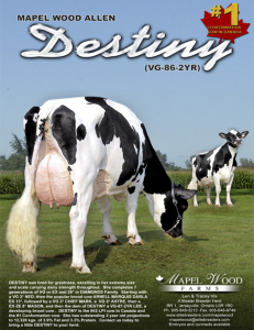 Space is at a premium for any print ad. How do you get your fellow breeder’s attention when working with such little room? With so much to say and so little room many breeders try to cram in as much text as possible and as many different animals as they can. White space is also an important element to include in your ad. White space is essentially empty space. While it may seem to be a waste of precious space in so small an area, white space actually will make your ad clearer and more easily understood. Remember that, although you are trying to squeeze in all your information, a solid block of text won’t be read at all. Plus, if your ad is clean and uncluttered, it will literally jump off the page when it’s surrounded by ads that are not.
Placing any type in all capitals is generally a bad idea as well. Text in all capitals has little contrast, as all the letters are the same height. Studies show that people’s brains process text written in lower case letters much better. In fact, the brain processes familiar words partly by the shape they form when written in lower case letters. By using all capitals, you slow your reader down, making it less likely he or she will actually read and comprehend your ad. Also, although there are thousands of fonts available now, it is still important to remember to use only one or two in an ad. Too many typefaces can distract the reader and make your ad difficult to read.
 A Picture Is Worth A Thousand Words
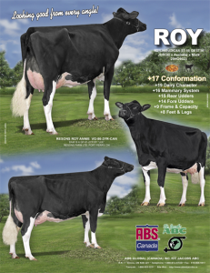
There is no question that a picture draws readers in. Instead of just a boring side shot, try to get different angles of your cattle. Three quarter rear shots are great at grabbing attention. Show multiple angles of your cow, in order to gain maximum attention.
The best ads use images that are interesting and large! As a general rule, your graphics should take up at least a quarter of your available space and can go up from there. Small graphics are distracting to your readers and do not have enough interest to draw a reader into the ad.
(To learn more check out our interview with the best in the business, Patty Jones, about how to get the perfect picture).
 Balancing Act
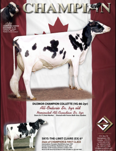
Just as it is with a great dairy cow, balance is very important. This doesn’t mean you necessarily have to center everything in your ad. In fact, it is often more interesting to place elements of your ad aligned all to the right or all to the left. Try to get balance from strategically placing elements such as cattle images, graphics, type, and logos in such a way that your ad flows well and is balanced across the space. If one side is heavy in type, place a large cow picture or logo on the other side. Most people read ads in a kind of reversed “S” pattern. That is, they scan an ad beginning at the top left and end up down at the bottom right. It is helpful to remember this pattern when you are laying out your ad.
(For more great thoughts regarding design, check out our interview with Pam Nunes about the fine art of marketing great breeding .)
Know Your Market
When considering placing your ad, it’s important to know what type of market you are speaking to. Each of the major magazines caters to different geographic marketplaces, which have different interests. When advertising in Holstein Journal focus on LPI, and type; in Holstein World, TPI and overall production, and Holstein International look for health traits and unique features like polled or Red factor.
Call to Action
When designing your ad, don’t forget the main purpose of the ad—to sell! You have to give the reader a clear path to take. This can be as simple as remembering to place a phone number in a prominent place in the ad. Alternatively, it can be more detailed and can include such elements as a web address or social media page. This should be both the starting and ending point of your print ad design. Know before you start what your objective is, and end by critically examining your ad to make sure that it meets that goal.
The Bullvine Bottom Line
The dairy genetics market is as hot as it has ever been. However, now more than ever, you need to get your breeding program known. One of the great ways to do that is magazine advertising. Magazine advertising represents a large portion of many breeders’ promotional budgets. It is no longer enough just to advertise. To attract the buyers you’re seeking, your ad must stand out and get attention.
Want to take your ad’s to the next level, check out our dairy ad design services.







Working on developing an ad right now, thanks for the revenant info!